Olivia King has always been passionate about typography. A creative director and typographer and the creator of Penguin Inclusive Sans, a global font for Penguin Books, she has a growing reputation as an inclusive typography specialist – but she’ll be the first to tell you that she and font design weren’t initially a natural fit.
“I’ve been obsessed with typography since first-year uni. It didn’t click right away—those early assignments were a challenge—but when it finally did, it felt like a revelation,” says Liv, a graduate of the UTS Bachelor of Design in Visual Communication, Bachelor of Design (Honours).
“I used to think this was just something I was passionate about, but I never believed it could turn into a career path.”
A non-linear design career
For Liv, the path from keen student to skilled typographer has been varied and rich. She’s worked in letterpress printmaking, graphic design, branding and digital product design, both as a freelancer and as a creative at leading global agencies like ustwo and For The People.
This jack-of-all-trades career approach is in large part the result of the UTS Visual Communication program, which equips graduates with the skills to work in any—and every—design discipline. The curriculum spans everything from motion graphics and web media to user experience and interaction design, illustration and animation, virtual reality and AI, introducing students to the breadth of the design profession and teaching them how to apply their creativity in a diversity of professional settings.
“Anything that really involves that foundational fundamental skill or visual communication is where I think the UTS course sets you up really well,” she says.
After years in the business, a new discovery
These foundations set Liv up for the perfect opportunity when she came across the concept of accessible typography.
At the time, she was working at For the People on a project for a disability services client. She and her team were looking at ways to make the design and brand as accessible as possible
“My colleague had been doing research into typography [and discovered that we could] make type accessible at the character level,” Liv says.
“I’d never heard of this before. I thought it was amazing.”
Accessible fonts incorporate a number of features that make them useful for a wide range of readers, such as non-mirroring of letters (like d and b), wide spacing between letters, and distinction between similar shapes (such as the letter O and the number 0).
Liv was fascinated, but when she went looking for an accessible font to use in her project, she discovered there were few options available.
“I thought, I'm going to make this my challenge,” she says.
When COVID lockdowns hit, Liv embarked upon a new project and started making her own inclusive typeface, which she named Inclusive Sans. She ultimately decided to release it on open-source font library Google Fonts.
“I was looking at the stats of one of the bigger fonts [on Google Fonts] and something like 30 million people [had downloaded it that week], and I thought whoa, this is an amazing platform,” she says.
“[I decided], I'm going to just put it up on here. I'd rather people have it for free. It's in the spirit of accessibility to really make it easy for people [to use it].”
Type that transforms a global brand
Inclusive Sans was an instant success, resulting in more than 2 million downloads in its first week. But the real breakthrough moment was when it caught the eye of the branding team at Penguin Books. A rep reached out to see if Liv would be interested to work on another accessible font project, this time to support Penguin’s global brand.
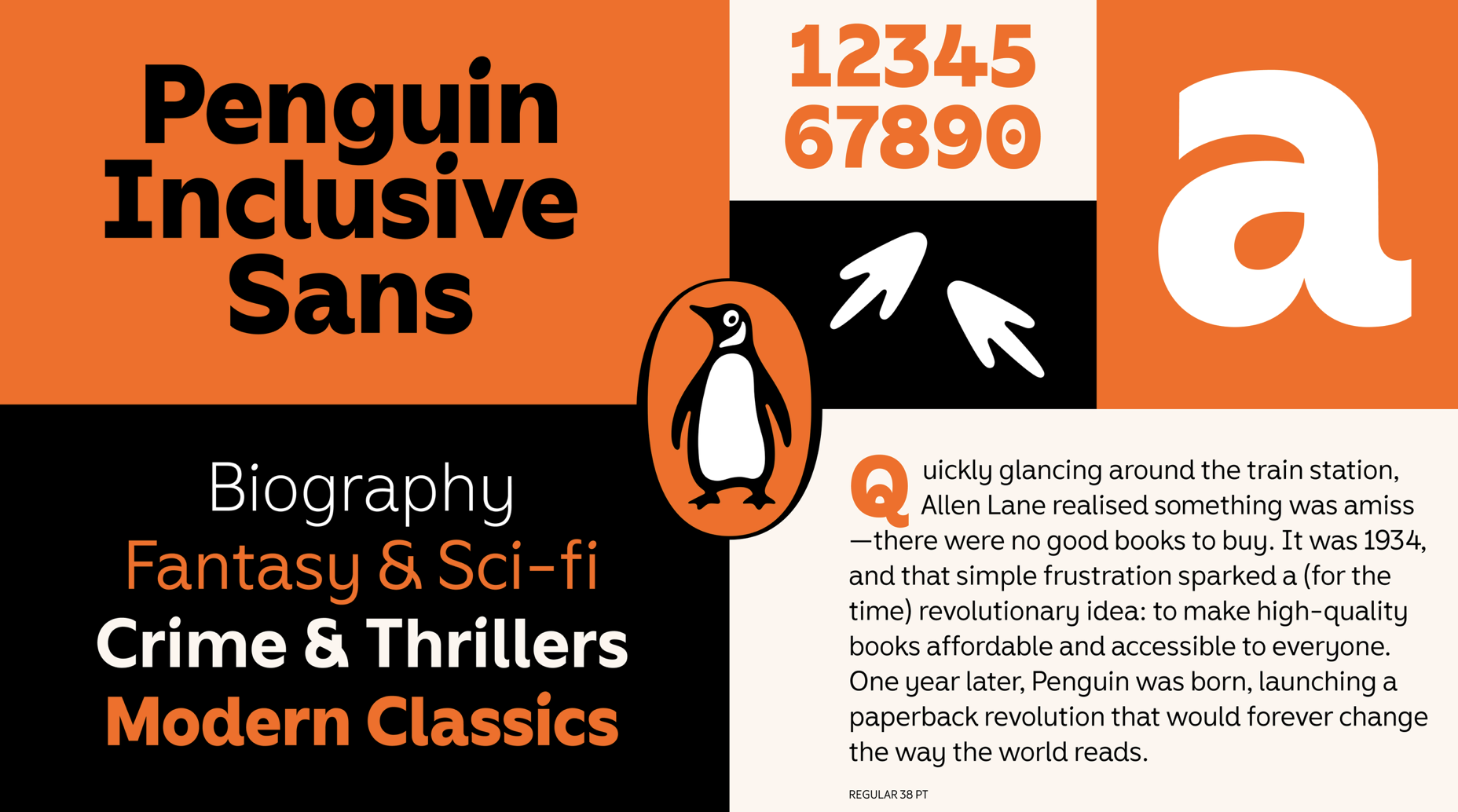
The result, Penguin Inclusive Sans, pays homage to Penguin’s rich history while setting the brand up for the future. As a brand typeface, it will feature on the company’s website and in all its corporate communications and signage in every market— its 530 glyphs can support over 600 languages.
“I also found out recently that every new book printed with Penguin will have a page at the back that tells a short history of Penguin, and that's all in the new font. So it's really exciting that most of these books will now have my type in them going forward,” Liv says.
Today, Liv is exploring a range of new typography projects that have started coming her way since the release of the Penguin collaboration.
“Doing the Penguin project has really made me reflect on how my skillset has grown,” she says.
“The UTS Visual Communication degree set the groundwork for a diverse and varied design foundation, one that has guided me along a path of twists and turns that has ultimately led me to the multidisciplinary designer I am today.”